Tuesday 14 October 2008

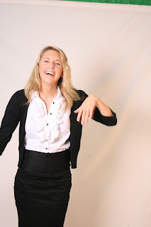
Here is the cropped image of my friend Emily. With the edited contrast and brightness. 
Here is a screen grab of the photograph after i have played around the the Opacity feature of the brush tool. I'm not sure this is the best way to do this effect, and with more exploration of the Photoshop program i will be able to discover a better way of doing this technique. 

Here are a few screen grabs of my work in progress with one of the other photographs from today.

After using the cut out tool, i put the photograph onto a blank new document, where i then used the fill bucket to pore bright aqua blue into the background.
Using the stroke tool, i selected the figures closely and then the stroke tool created a bigger gap between figure and background. As you can see below.
I then used the saturation tool to reduce the saturation of the figures, to give it this effect.


I really like this effect because it mirrors the same style as the album cover work. 

The beginning of my album art work

During my media lesson today i began to experiment with some photographs, so that i could begin looking into how the Ting Ting's album art work was created. 

 I used my two friends Megan and Emily so stand infront of a white sheeted backdrop, so that i could take some photographs that mirror the same positions of those in the cover art.

Here are a few of the shots i took from today.


After taking these, i started to experiment on photoshop. I first edited the colour, brightness, and contrast. I used the photograph above as my trail photo. I cropped it down, and edited the contrast. After this i used Adobe Photoshop to cut out the figure from the background and made a new photo. 


I filled the background of the photo in block red. Using the layer tool on Photoshop i managed to use the tool "Stroke" to give an even and subtle white outline around the figure.
I then used the saturation took to take all of the colour out of the figure. Once this had been done I used the brush tool to paint some of the hair bright yellow, the same as we see on the album cover.


Wednesday 8 October 2008


Continuing my research on modern popular bands, I looked at the Snow Patrol, The Arctic Monkeys, The View and The Kooks websites. 

I liked these websites, they are modern and have a lot of information about the bands, so the reader can find the information they are looking for. There are also video clips, tour dates, and galleries on all of these websites. 
After looking at these websites,  (even though there was nothing wrong with them) I felt that the one I liked the most was the Ting Tings website. I have decided to base my band on their band, and recreate a webpage and cover art like theirs.

I will start by taking photographs of two figures, in different positions to experiment with the photographs. Then I will be using photoshop to edit and create the cartoon effect on the figures. 
To create the webpage I will be using iWeb. This gives me a basic outline of a webpage and allows me to edit it, and to create pages such as blog, shop, news, and all of the other links that I have seen on the websites that I have been researching from.

Tuesday 7 October 2008

Websites

After looking at the website of The Ting Tings, I continued to look at the websites of the other bands that I have looked at.
I looked at The Enemy's webpage. There is a lot of links on the main page, including links such as news, gallery, blog, and shop. The main menu is in the top left hand corner, with a big black bold title of their band name. This really stands out against the red of the background. 
The website, looks organized, but it looks jumbled up as well. The contents of the main page is in eat columns but there is a great deal of different fonts used, I don't like this effect. 

Wednesday 1 October 2008

Album Covers cont.

Cover Art

I continued to look at album covers for more recent and new bands.
I looked at the album work of The Ting Tings, Maximo Park, The Enemy, Oasis and The Wombats.
I like this cover from The Emeny's
 album "We'll live and die in these towns". The writing is clear and stands out well against the black background. 

I don't think i would do an album cover like this myself though because i think its a bit boring and its not exiting enough for me.


Where as the album covers for The Wombats and The Ting Tings, are far
 more exciting and colourful. This is why i have chosen to base my album art work on the work of these two covers. I like the bright and bold text on both and the bright red background on The Ting Tings cover. 


After finally finding cover art that I want to base my own on, I took a look at the websites for all of them. 

Websites

Here is a screen grab of the Ting Tings website. www.thetingtings.com
They have used really bright colours on every page of the website. They have also illu
strated the images to make they look modern and interesting. I feel that the design of
 the website really reflects the genre of music that they produce. 
On the main page of the website they have a vertical menu, which enables the viewer to move onto different pages of the website. For example there is an "images" page, which contains photographs of the bands gigs and professional photographs taken and edited of the band.
 There is also an album for the cover art of the band. 
Alongside the images page, there is also blog, information about the band (history), a members signing up page, recordings, gigs, and buying music and tickets pages. 
I am going to incorporate these pages into my website for my band. 

I have taken some screen grabs of the website. This is the main homepage, followed by the images gallery, and a grab of the menu. 


Thursday 25 September 2008

Album Covers


I think its really clever how they have managed to merge the two album covers together.

Tuesday 9 September 2008

Album Artwork Research

Research


For my media studies coursework I am going to create a web page, and a CD cover for a made up band of my own.I have been researching album artwork that I like. Using google.com image search i have been able to gather together all of the album covers that i like. I started searching for the "classic" cover art, like the artwork for Pink Floyd's "Dark Side of the Moon" album. I really like this because its so simple. After looking at some other cover art of Pink Floyd's i moved on to looking at Bon Jovi's cover art. I found the cover for "Lost Highway", which i really liked. I like the way the whole cover is framed by the inside of the car, and the road disappears into the distance. The artist has also used depth of field to focus more on the road in-front of the car, instead of the focus being on the inside of the car. The soft focus of the car interior makes the title of the cover stand out a lot more.

This was my favorite cover art of Bon Jovi's, so after doing some more research on them i found the art work for the Beatles. The work has a really good personality about it. It has a comic edge to it. For example, the cover art for 'Help!" is amusing, because they are grown men, in raincoats that are too big for them, and they are keeping straight faces, while standing in strange positions. 

Also the cover for "A Hard Day's Night" is comic, there are several captions of the band,
 pulling different faces. By being monochrome,  with a large contrast really picks out the facia
l expressions of the faces. 

Album - "1"
Date - 2000


Album - "Past Masters"
Date - 1988


When I was researching the album artwork for The Beatles, I came across the cover art for "Abbey Road", and someone had murged the background with the album work for Oasis's album cover of "(What's the Story?) Morning Glory". Which led me on to having a look at Oasis's cover art.